|

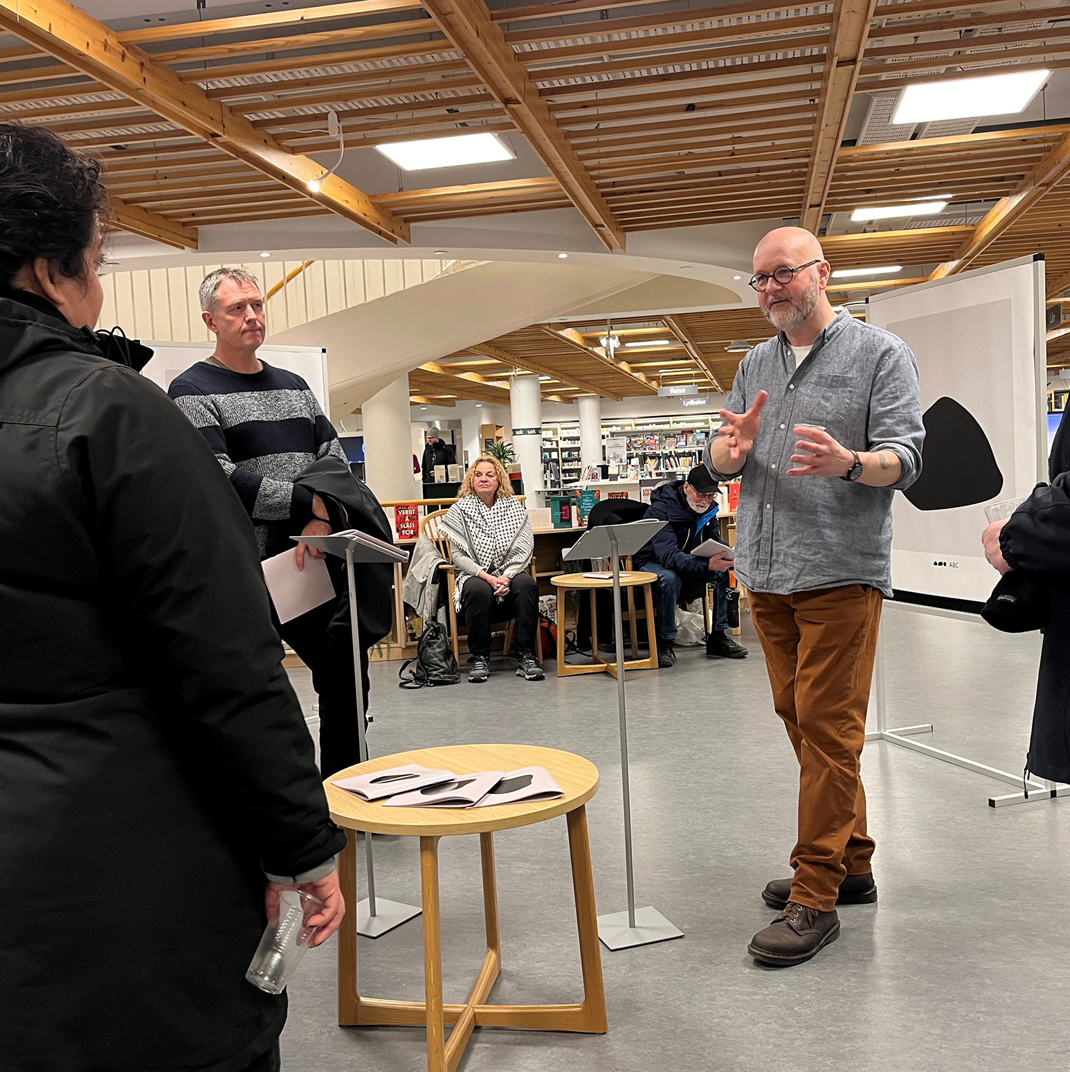
From exhibition in Trondheim public library, 2024.
ABSTRACT TYPOGRAPHY
This is a typographic experiement. All letters are basically figures that over time have been stylized and abstracted. The characters in most alphabets are no longer recognizable as the figures they started as, unless you know what to look for. The letter A for example, comes from the word Aleph and is a western semittic word meaning ox. Maybe you can see the head of the ox if you turn the A on its head?
We have later learned that these figures that make up the alphabet represent sounds that can be put together into meaningful words and text. In semiotics, one points to the fact that it is not the sign itself, but the system that determines whether a sign has potential for meaning.
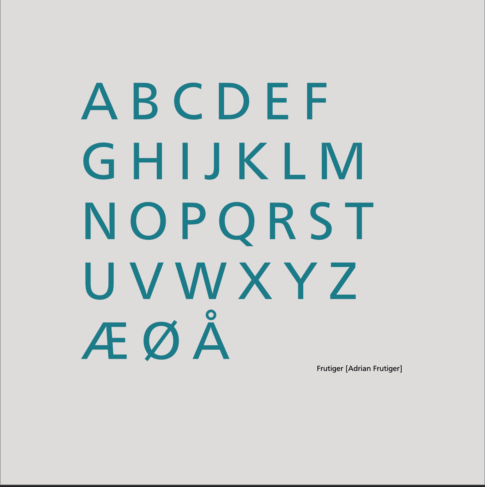
I have always thought letters and caracters are beautiful, even if they are from alphabets and languages I do not understand. Many graphic designers and typographers have probably experienced the exercise of creating abstract typeface-images as part of their training. The Swiss typographer Adrian Frutiger (1928–2015) experimented with pure abstract forms throughout his career. He took as his starting point naturalistic studies and stylized and abstracted them until they became completely free forms. Frutiger did many experiments with symbols and abstracted/stylized forms and their counter-forms (Forms & Counterforms). Most of these were based on references to nature, which he then stylized and abstracted.
Frutiger was one of the most important people in the transition from analogue to digital typography, and it is therefore fitting that this completely abstract typeface is inspired by his work. But Frutiger never put his abstract works together in a alphabet. Frutiger mostly kept a link to the literary through titles that led the mind to something concrete. But why not take it one step further?
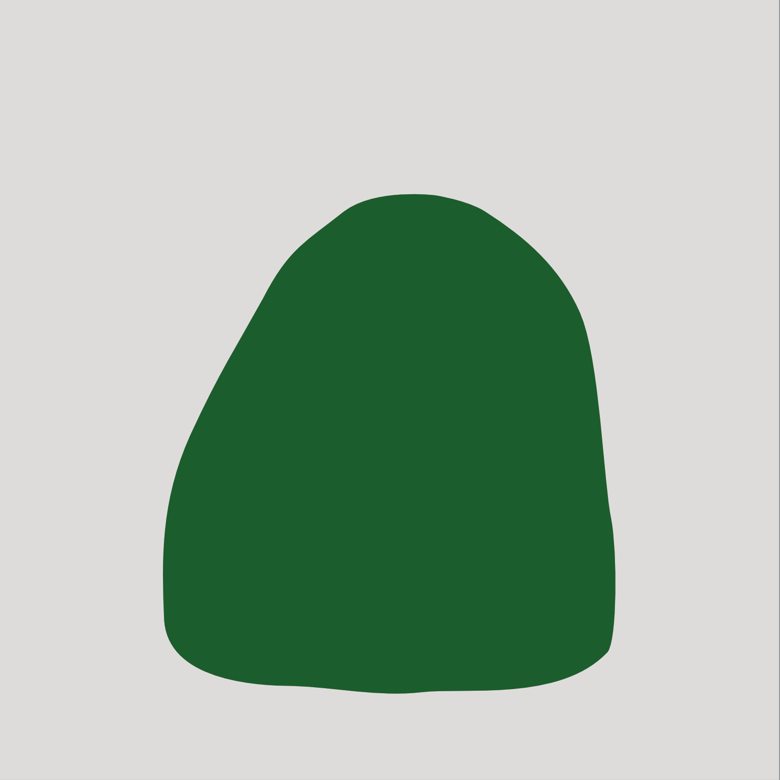
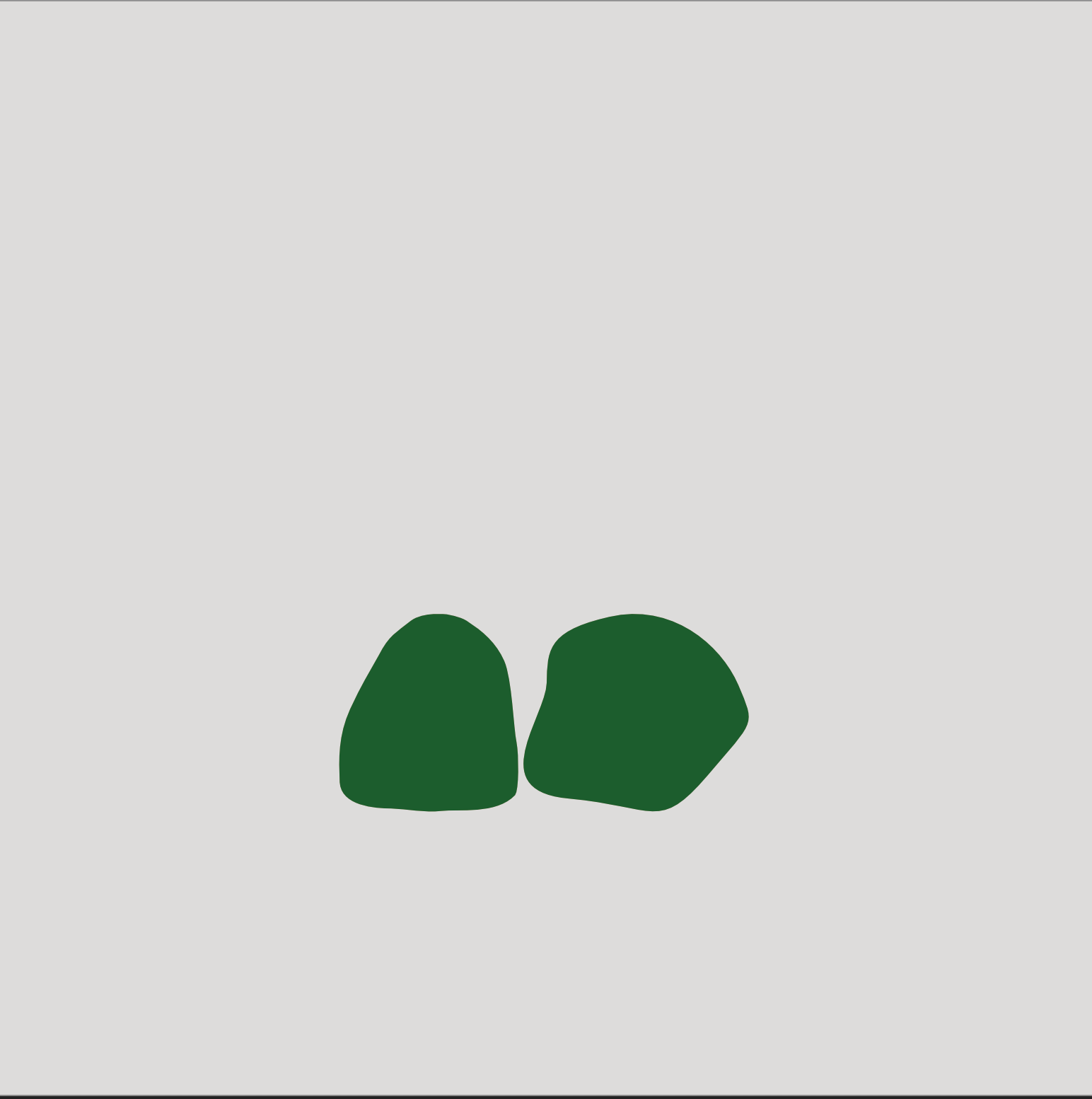
A typographer is a craftsman, who will help the author of a text to convey a message. But the typographer is also a designer, who uses the shapes of the letters along with spac, colour and contrasts to create visual expressions. Different typefaces can have different visual expressions. An A in Times New Roman has a totaly different expression than the same character in Helvetica. In these graphic experiments, which I have chosen to call Abstract Typography, I have worked with the idea of creating completely new character sets based on series of abstract graphic figures with no concrete references. The characters are designed with a view to having a visual relationship, but not resembling anything we know from nature.
I have assigned these characters places in the alphabet, then assembled them into a typeface and created a font that i installed on my computer. Then I wrote words and lines of text with this “abstract font". In the work I have used excerpts from the book Alice's Adventures in Wonderland, by Lewis Carroll. It struck me that this text fit as a parallel to my journey into the world of abstract typography. It has in a way become my own rabbit-hole — where I constantly find things that turn my perception of reality on its head.
This project is closely related to semiotics, but is more about focusing on the function of typography in visual communication than sign-using behaviour. It is perhaps tempting to draw parallels to suprematism/constructism or other abstract movements from the history of art but, although nothing is detached from history and this project also of course rests on the shoulders of others, this is primarily graphic experiments that are meant to be seen and read as typography. It is therefore more relevant to see this in the light of the tradition of the graphic/typographic craft. The project therefore moves in a field of tension which I find interesting.
In the abstract typography project, I think that when you look at the signs with semiotics glasses, i.e. you analyze the signs with denotation and connotation, the denotation is: "we see a form that can be described geometrically», but it has no references to nature. Connotation, on the other hand, is the meaning we attribute to the sign. You can then look at the typographical image from a social semiotic perspective: How the social context affects the meaning of the signs.
The abstract typography communicates by virtue of its shapes. The purpose of this is first and foremost to create graphic exercises, where I seek to train the eye and challenge my self and the reader to see the text in a new way.
[Mads Nordtvedt 2023]

From exhibition opening in Trondheim public library, 2024.


|

